Support and resistance. How to plot horizontal levels
In this article we’ll talk about how to plot horizontal support and resistance levels. Apart from this, we will analyze for what reason they are invented and how to determine and apply them in trading. First of all, it is worth noting that horizontal support and resistance levels work on all timeframes without exception.
Therefore, such approach to trading will be useful both for those traders who open positions within the day, that is, for those who trades short-term and for those who are ready to hold positions for several weeks, in other words, who trades medium-term.
Contents
- On what timeframes is it necessary to draw horizontal levels?
- Key conditions for horizontal levels formation
- EURAUD. Example of plotting support level and resistance level
- GBPUSD. Example of plotting support/resistance levels
On what timeframes is it necessary to draw horizontal levels?
It is necessary to start plotting levels beginning from major timeframes and gradually go down up to the timeframe on which you want to trade. Why is it necessary to act in this way?
First of all, I recommend to start analyzing markets from the Daily timeframe since Daily is the most reliable timeframe and it is used by all the largest market participants without exception. They are banks, investment funds, that is the market participants that are capable of influencing the change in demand and supply in the financial market and thereby move the price either in one direction or in another. These market participants trade the Daily timeframe as they cannot like any other private trader in one click open a position of the required size.
They accumulate their position for a long time to get the best prices when opening the position, the same applies to the exit from the market when positions can be closed within several days. This often occurs around key levels of the Daily timeframe. Therefore, the most reliable signals are formed on the Daily timeframe and it is important to understand in what condition the market is on this timeframe.
If you are trading the Daily timeframe, then it is important to plot levels on this timeframe for further market marking understanding and the price movement potential in one direction or in another.
The quote from «Market Wizards»
Ed provided an excellent role model. For example, one time, he was short silver and the market just kept eking down, a half penny a day, a penny a day. Everyone else seemed to be bullish, talking about why silver had to go up because it was so cheap, but Ed just stayed short. Ed said, “The trend is down, and I’m going to stay short until the trend changes.” I learned patience from him in the way he followed the trend.
Michael Marcus — commodities trader
If you are trading on a smaller timeframe, for example, on the one-hour timeframe (H1), then it is important for you to understand, first of all, in what direction the largest traders tend to trade as the Daily trend evolves. Afterwards, it will be necessary to switch to the one-hour timeframe (H1) and to start plotting levels in the same way and starting from this, seek for entry points (either bullish or bearish) on this timeframe.
The signal quality on the smaller timeframe in the direction of the main trend, i.e. trend on the Daily timeframe will be much higher and in this case you will have the opportunity to get an excellent risk-reward ratio. It will give you a chance to look for those market entry points in which risk will be much lower than the possible profit potential, that you may obtain in this position.
Key conditions for horizontal levels formation
You should realize that a level is not a one-point thick line, namely the price zone that is plotted from the borders of the bodies to the shadows of the candles, in which the market movement changes its direction from the bottom-up or vice versa.
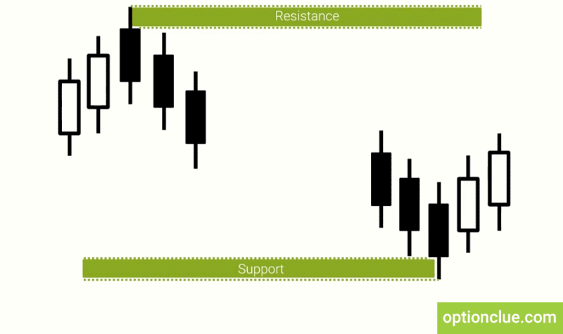
Levels are often formed by 3-6 candles, at the same time, if you see a reversal formation in the market, where 4 candles are involved, i.e. 2 bullish and then 2 bearish, or 2 bearish and 2 bullish, then this is definitely the resistance or support level (Figure 1).
The important aspect of the levels formation is whether you can see the level visually or not, i.e. if you suppose there is a market reversal at A point from the bottom-up or from the top down, then the probability of its existence is about 80-90%.
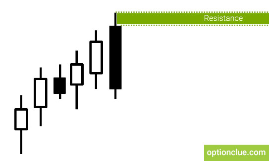
There are situations in which levels are formed just with 3 candles, for example, if there is a bullish movement in the market, which ends with the close of a large bear candle that overlaps several previous ones (Figure 2) this can indicate that a level has been formed at this point.
There are patterns that are more complex when levels are formed by 5, 6 and sometimes even by 10 candles, among which there are doji, bull and bear candles alternation or price gaps. However, all this doesn’t matter if at first, you see the price reversal visually and if more than 3 candles take part in this reversal.
EURAUD. Example of plotting support level and resistance lines
Let’s take an example. It’s Forex, EURAUD, events since March. How to determine where is the nearest resistance level? The current price when writing this article is 1.4102.
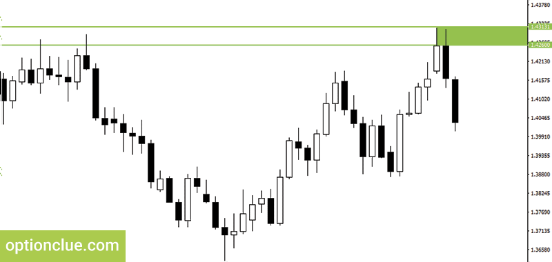
The nearest resistance level was formed in candles, from March the 24th, 27th and March the 28th i.e. the market was rising during 5 days and after that there was a bear candle overlapping that caused the level formation by 3 candles. Let’s determine the upper border of the resistance level along the shadow of the bull candle that is involved in the reversal. The price is 1.4313. Let’s underline the lower border of this level. It’s plotted according to the candles borders in this reversal. The price is 1.4260. You can see that this level has a rather wide price zone, approximately 50 points, that is normal for the Daily timeframe. For the convenience of further perception of this level, I recommend to paint out it with a color (Figure 3).
We can use the rectangle as a graphic figure for painting out this level. We’ve just fulfilled a part of work by plotting the resistance level.
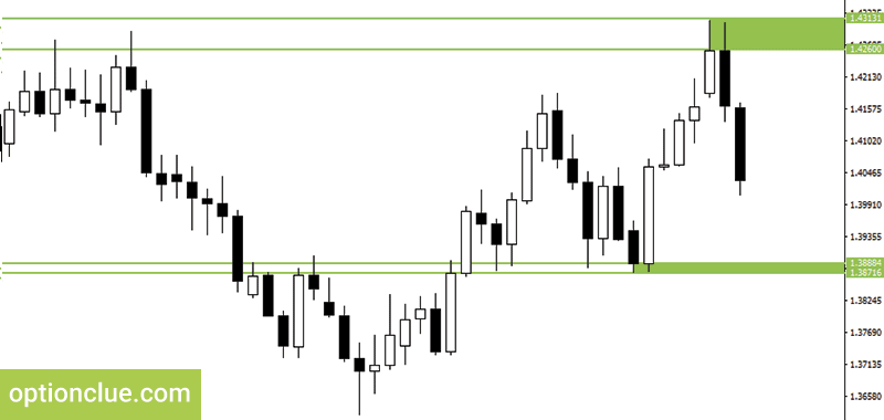
Now our task is to plot a similar support level. We also look at where it is relative to the current price, get down below, just 4 candles back and see that the market’s upward reversal occurred in the candles on March the 17th, 20th and 21st, ie. after the last candle’s closing the market reversal was formed as there was a declining movement which came to the end with active rising.
Similarly, we are plotting the borders of this level: 1.3874 is the border along the shadow, 1.3886 is the border along the bodies of the candles. We paint out this level by a color rectangle. So, we’ve plotted two levels – the nearest resistance and support levels (Figure 4).
The support level is the level of the first type, where 2 bearish and 2 bullish candles are, the resistance level is more complicated, but here we can visually see the market reversal as there is a bullish movement that was absorbed by 2 candles.
GBPUSD. Example of plotting support/resistance levels
Let’s plot now support and resistance levels on another financial instrument. Let it be the GBPUSD currency pair, events since March.
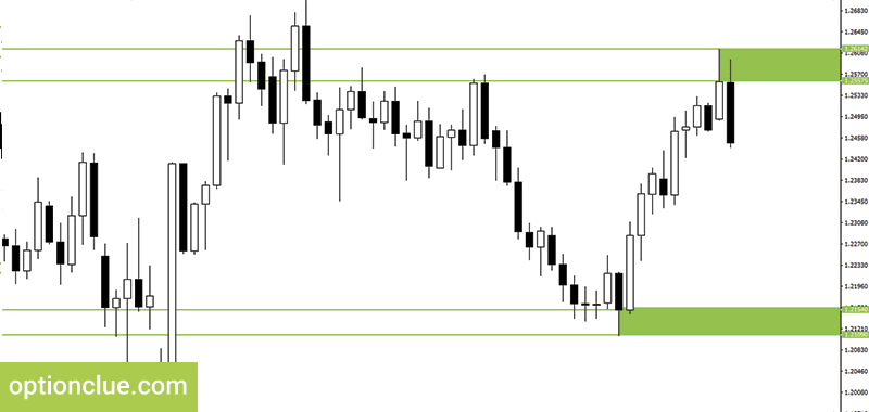
By analogy with the EURAUD currency pair it’s important to switch to the Daily timeframe. The current price of the pound versus the dollar when writing this article is 1.2466 and our main task is to plot the next levels.
Let’s start with the resistance level. We look at where is the visually located nearest price reversal from the bottom-up. These are candles, which were formed on the 27th and 28th of March. Here, after the bullish movement, which included several large bull candles there was an aggressive bear candle. Hence, the resistance level is formed here, not the simplest, but visually well-defined.
The upper border of this level is determined by the shadow of a bull candle, which is involved in the reversal. This price is 1.2614.
The lower border of this level is plotted along the bodies of the candles, the price is 1.2557. Here we will paint out this level with a certain color so that we can clearly see it in the future.
Now we will do the same with the support level. I think there is no doubt where it is. The lower border of the support level is 1.2109, the upper border is 1.2154. How do we determine that the level is exactly at this point? There was a downward movement and then the market began to rise rapidly and after that, it was strengthening for a long time. Therefore, here we see the market reversal from the bottom-up (Figure 5).
We’ve plotted two nearest support and resistance levels on 2 financial instruments. For what? To subsequently use the basic properties of horizontal levels in trading. We will analyze how to do it correctly in the following trading articles.
Traders often make the process of plotting horizontal support and resistance levels much more difficult than it needs to be. Some of them tend to complicate this task by plotting unnecessary levels confusing them in determining further price movements in directed trading. After getting the Levels indicator you won’t have any difficulty in this due to the simplicity of its use. It can help not only identify price zones where the market movement can slow down or price reversal is likely to occur but also find entry signals that appear during a deep market correction or calculate stop-loss and take-profit.
Good luck in trading!

